How I Escaped the Manual SEO Reporting Trap with Automated Tableau Dashboards
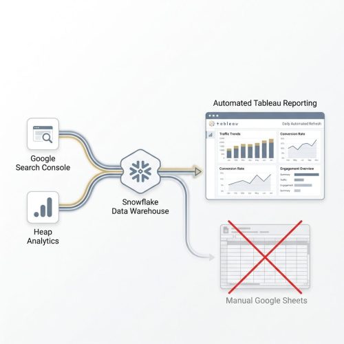
How I re-engineered Manual Google Sheet reporting to Custom Tableau dashboards
Why Spreadsheets Drained My Team’s Productivity
I believe weekly updates and organic performance reporting should never involve tedious, manual data copying. When I joined the team, the team was juggling multiple data sources, various Tableau Dashboards, filters and pasting rows into spreadsheets. It became clear that this manual copy-paste workflow was error-prone, inconsistent, and consuming our time. At our scale, manual reporting was a major bottleneck.
When I was managing organic performance at Eventbrite—handling millions of dynamically generated event and directory pages—I realized how much time we were losing to administrative tasks. Every week, we spent hours extracting data from Google Search Console, Heap Analytics, and various tableau dashboards just to merge them manually into a master Google Sheet. This was one of the ask from my manager Joao and I decided to fix this. I connected with the analytics team, learned Tableau, and re-engineered our reporting pipeline. Our data already existed inside the Snowflake data warehouse. I eliminated these manual spreadsheets by building custom dashboards in Tableau, and created a single source of truth for SEO Team.
The Challenge: Standard Tableau dashboards for all teams
Our reporting data was residing in Heap and GSC.
Heap was somewhere sorted, as we already had data in snowflake tables which were powering Existing Tableau Dashboards.
The problem was not the availability of data or dashboards, but to have everything in a single view.
The existing Dashboards had everything but could be directly used for reporting because of 3 reasons-
- Organic traffic and customer journey data were spread across different dashboards and needed filters to see.
- SEO team needed different views which were not standard across all channels.
- Google Search Console (our source of truth for search impressions, keywords, and organic clicks) was not connected to snowflake, leading to manual data pulls.

Juggling manual CSV exports from siloed platforms consumed up to 20% of my weekly capacity in repetitive, error-prone data compilation.
To compile a standard weekly or monthly performance report, I had to crawl different Tableau Worksheets individually, apply date filters, select organic channels, and download separate CSV files or copy data. I then had to paste the numbers in the respective cells of the Google Sheets.
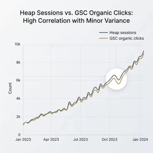
We also needed to compare weekly trends of traffic in GSC with the numbers reported by Heap in our Tableau dashboards –
- By TLDs
- By Page Groups
- By Type (Creator & Consumer)
Siloed Metrics and the Hidden Cost of Reporting Latency
Beyond the lost hours, manual reports introduced data latency and mistakes. When metrics lived in siloed spreadsheets, they remained static. If a revenue metric changes due to refunds or cancelled events in Snowflake Dashboard, it either remain hidden or we had to manually update the past in Google Sheet, I might not notice the discrepancy for weeks, leading to flawed decisions.
"Static spreadsheets acted as a wall. If my team could not query performance indicators dynamically, if my numbers are not aligned with the database, we were operating in the dark."
Furthermore, it was not easy to do analysis as data existed in different views behind various filters. If a team member wanted to analyze week on week search performance by analyzing different metrics like traffic, tickets sold, creator acquisition, they had to download the data and build custom charts in Google sheets.
The manual efforts to do this every time caused delay. This delay created a real gap between the data and the people who needed to make decisions.
Identifying Data Sources
Learning where and how of data
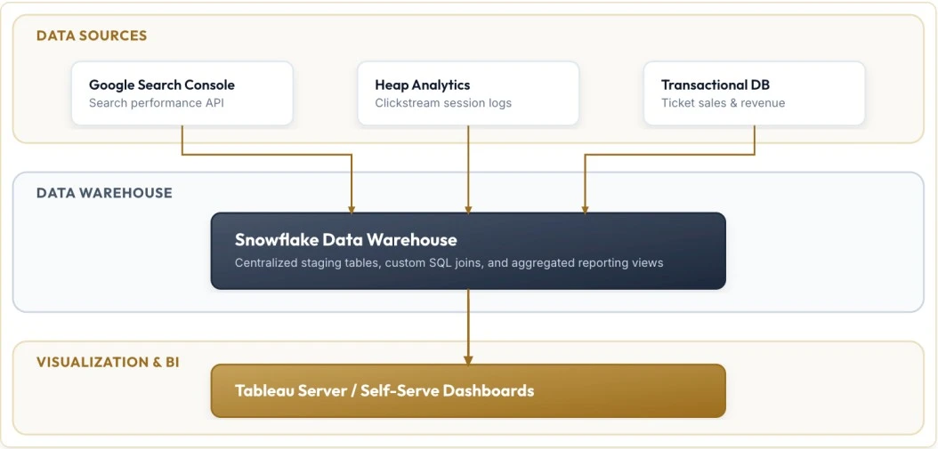
To establish a single source of truth and maintain sync between reporting at company level and SEO, I decided to shift SEO reporting from Google Sheets to the Tableau Dashboards. This centralization process involved identifying right data tables in Snowflake and building custom required views. Additionally we need GSC data in Snowflake.
I worked with the analytics teams and learned about how data lives in Snowflake Data Tables, what each column means, custom dimensions, and formulas used to build Centralized dashboards.
Finally, maintain the sync between the Centralized dashboards and my dashboards so that we can report it with confidence.
How I Resolved the Google Search Console Data Gap
One key obstacle in this data centralization plan was the absence of search performance data in the warehouse. While clickstream and transactional data were already stored in Snowflake, keyword-level metrics from Google Search Console were not. I collaborated with the Analytics team to build a dedicated ingestion pipeline.
Using the Google Search Console API, they developed a script that runs weekly, pulling search impressions, clicks, average positions, and queries at the URL level. This data is loaded directly into the GSC table in Snowflake. By loading the raw API data directly, we bypassed the 16-month data retention limit enforced by Google’s web interface, creating a permanent historical archive.
Not only that we got some extra metrics for analysis impressions and queries (branded & non branded), which actually empowered the dashboards I built and also helped me to frame Demand to conversion User Flow in a single dashboard (that I will explain in a separate blog).
Designing SEO Reporting Dashboards
Once I centralized the data, I focused on building the visualization in Tableau. My main goal was to replace the manual data-filtering process and copy pasting it to Google Sheets.
In Tableau, I solved this by implementing dynamic filtered views as reported by SEO team.
I built a few calculated fields also like CvR, date, etc. thanks to YouTube tutorial videos and our own Data Analytics Team.
I planned various dashboards including-
- Weekly / Monthly SEO Dashboard
- Sessions Dashboard
- Orders + Tickets + Revenue Dashboard
- Creator Acquisition Dashboard
- CvR Dashboard
- Creator Performance Dashboard
- Consumer Performance Dashboard
- Creator Journey Dashboard
- GSC Dashboard
- GSC vs Heap Dashboard
Weekly / Monthly SEO Dashboard
This replaced the weekly and monthly efforts for updating Google Sheets every week and month for WBR & MBR.
Sessions Dashboard
This helped us to analyze sessions in a single view – WoW, MoM, YoY, organic vs other channels, sessions across different pagegroups & tlds.
Orders + Tickets + Revenue Dashboard
This dashboard helped us view the performance, and became one of the most viewed dashboards. We could compare channel wise performance by different pagegroups in a single view.
Creator Acquisition Dashboard
This dashboard gave us a view of the most important visualization for any UGC website, which was acquisition. These visualizations helped us to predict seasonal revenue/ ticket sales.
CvR Dashboard
This was something much needed, but didn’t exist. We had different data tables for sessions and orders with billions of rows and years of data, which could crash the Tableau dashboards also needed to create custom metrics. So I applied filters on data and was able to get the limited data which made it possible. This solved so many questions, every time we needed to compare which pagegroups converts better for which campaigns.
Creator & Consumer Performance Dashboard
This dashboard gave us the power to see different Metrics and their performance in a single view.
Creator Journey Dashboard
This was a much awaited dashboard, which solved all the questions related to traffic and revenue trends. This made us view the whole Creator Journey in a single dashboard. Week on Week, Month on Month, YoY comparison of-
Impressions -> Clicks-> Sessions recorded-> Signups -> Account Creation -> Event Create -> Event Publish -> First Ticket Sold
GSC Dashboard
This gave us flexibility to view data beyond 16 months limit of GSC, group it by week, month quarter or year, performance by Page groups and before google introduced it we could b=see Branded vs Non-branded performance. As this data was not sampled as in GSC, we had better data for analysis.
How we Reinvested Saved Hours into Strategic Insights

Answering Day-to-Day Questions on Demand
My transition to automated Tableau dashboards shifted my focus from data extraction to strategic analysis. Rather than spending valuable time building reports, I began using the interactive features of the dashboards to solve complex business questions.
In the second half of 2025 alone, I answered over 75 ad-hoc data analysis requests directly from the new Tableau Dashboards.
Using on-demand filters, I could instantly answer questions that previously required custom SQL queries from a data analyst. For example, I analyzed the performance of branded vs. non-branded queries to measure revenue generation from branded vs non-branded queries.
The Impact: Reclaiming Hours of Work
The operational efficiency the whole team gained by automating these reporting dashboards was substantial. By removing the need to manually copy data into Google Sheets, we not only reclaimed significant working hours, we were also able to do many analysis which we didn’t even though of previously.
Time savings accumulated rapidly. We saved about 2-4 hours of manual effort every week by each team member on standard status updates, and roughly 5 hours of manual effort on monthly performance reviews. Across a single quarter, this saved me approximately 70- 100 hours of manual work combined.
We redirected these hours toward high-impact technical initiatives.

Vishal Gupta
SEO & Digital marketing Leader. Talks about how to turn data into actionable insights and SEO / AEO automations.